
BOOKLET DESIGN (2019-2022)
Aunt Leah's Annual Report
Client
"Aunt Leah's helps prevent children in foster care from becoming homeless and mothers in need from losing custody of their children. To support them on their journey to self-sufficiency, we provide supported housing, job training and coaching on essential life skills."
Project
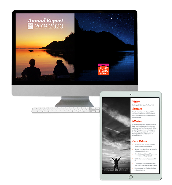
I proposed a layout re-design of Aunt Leah’s 2020 annual report. The aim was to improve information hierarchy, readability, and flow while still incorporating all the organization's brand colors.
Tools: ADOBE | Indesign, Photoshop, Illustrator
Impact
Aunt Leah's Place Executive Director, Sarah Stewart, was very happy with the new annual report, saying it was the best the organization has had. The document has also improved monthly donor engagement and has been critical in maintaining the organization's award-winning status.
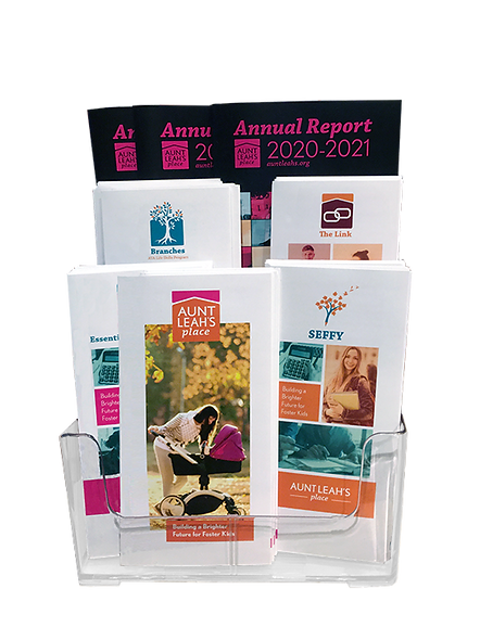
The completed design template was used for the next annual report as well.

Having a limited printing budget resulted in the size of the annual report pages being narrow, creating a thick and information dense 5.5 by 8 inch document. This severely inhibited readability
Since large blocks of text are difficult to read, more headers and differing font weights were added to make skimming the content easier. Adding an emphasis on information hierarchy and relying less on colourful boxes to organize content led to removal of visual clutter. Words per line were also reduced through the use of a two-column layout, further creating distinctions between differing content and increasing readability.
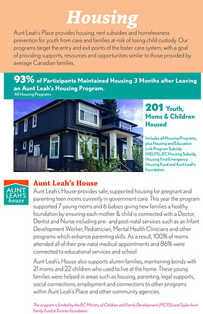
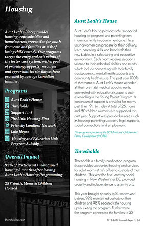
Previous annual report layout (left/former) compared to my redesign (right/latter)
Challenges & Solutions
Challenge
Solution
Aunt Leah’s Place has four branding colors, all of which were used generously in the previous annual report. Often with two or three present in the same page, creating confusion in visual hierarchy and flow, especially in combination with the lack of white space due to the narrowness of the document
-
Rather than use all the branding colors in each spread, the annual report was split into page types: orange as a focal color for general pages, teal for programming pages, and pink for social enterprises.
-
By using one color per section, reading flow is created, emphasizing impactful information, and highlighting calls-to-action. This design also allows use of all the colors within the annual report without them clashing with each other.
-
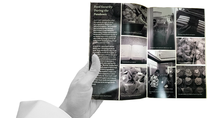
Black and white photos were used to reduce visual clutter. Blank or dark areas of the photos were used for text, allowing for more white space within the pages which increased readability.
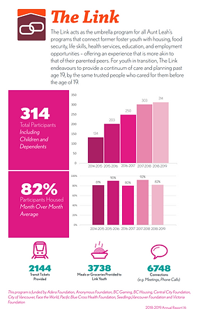
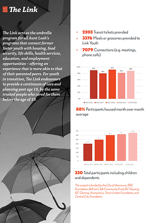
Previous annual report layout (left/former) compared to my redesign (right/latter)

Solution
Challenge
Process
-
Design research
-
Design drafting
-
-
Proposal to Team Lead
-
Proposal presentation and research for upper management
-
Completion of first draft
-
First round of editing
-
-
Completion of second draft
-
Second round of editing
-
-
Pending information confirmed from Annual General Meeting
-
Printed annual report completed
-
Digital annual report completed
-
Annual report sent to social media feeds
-
Project completion
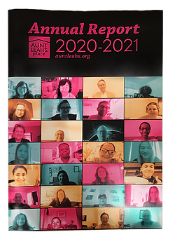
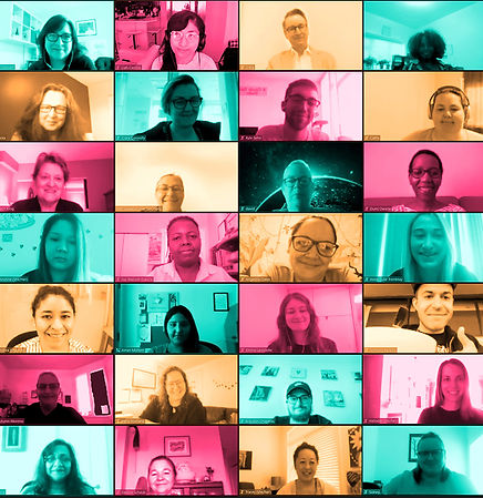
Cover of 2021's annual report which was also designed by me: a pop art stylized staff photo via video call